Five developer tools that show what they do.
None of them opens with three benefit cards and icons. They open with the product running: a terminal, an editor, a rack, code to copy. You see what they do before you read it.
AI-built software sites look so alike they have a uniform by now: dark background, a purple blur behind the headline, "The platform for modern teams" and a row of cards with Lucide icons. It shows most in this category, because the people looking at these pages know how they get made.
I picked five tools with opposite styles: one with almost no design, one drawn by hand, one that reads like a technical manual. What they share is that the product fills the first screen.
Oxide Computer
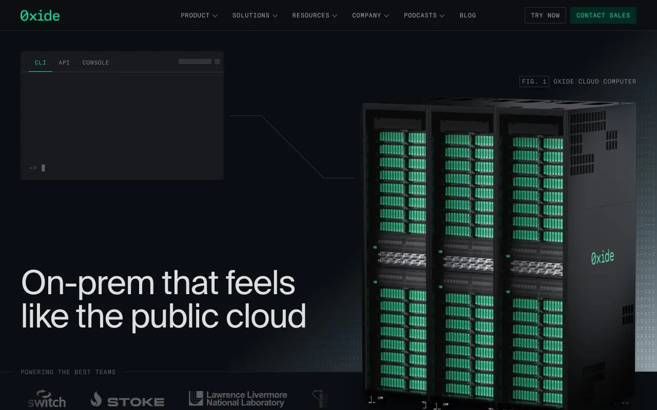
Oxide sells a server rack and presents it like a manual would: the image carries a caption, "Fig. 1 Oxide Cloud Computer", and a thin line links it to a terminal with three tabs (CLI, API, Console), the three ways to run it. The headline is a sentence the buyer gets right away: on-prem that feels like the public cloud.
There is one green, and it sits on everything that belongs to Oxide: the logo, the rack lights, the contact button. Nothing else gets color.
The takeaway: pick a language your audience already speaks (here, technical documentation) and commit to it, captions and figures included, instead of using it as decoration.
Zed
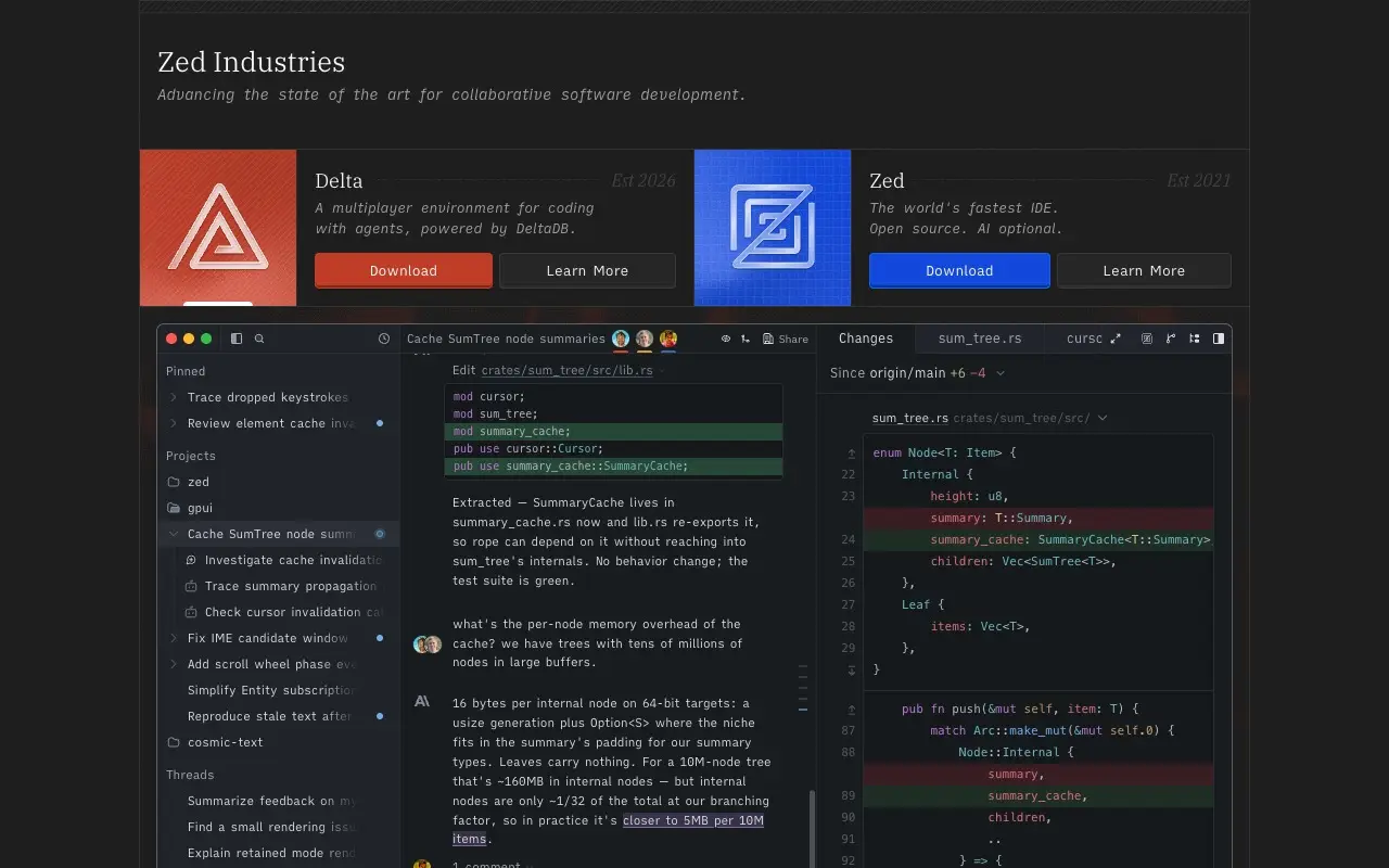
Zed sets its two products side by side, each with its own color (red for Delta, blue for Zed), its logo, one line on what it is and the year it started. Below sits the whole editor: the project list, a conversation with the agent about a change to sum_tree.rs, and the diff in red and green.
That editor isn't an image: the conversation and the code are text in the page's HTML. You can read it, select it, and search engines can read it too.
The takeaway: if your product is an interface, show it with believable, specific content, not gray placeholder bars. Detail sells harder than a slogan.
Fly.io
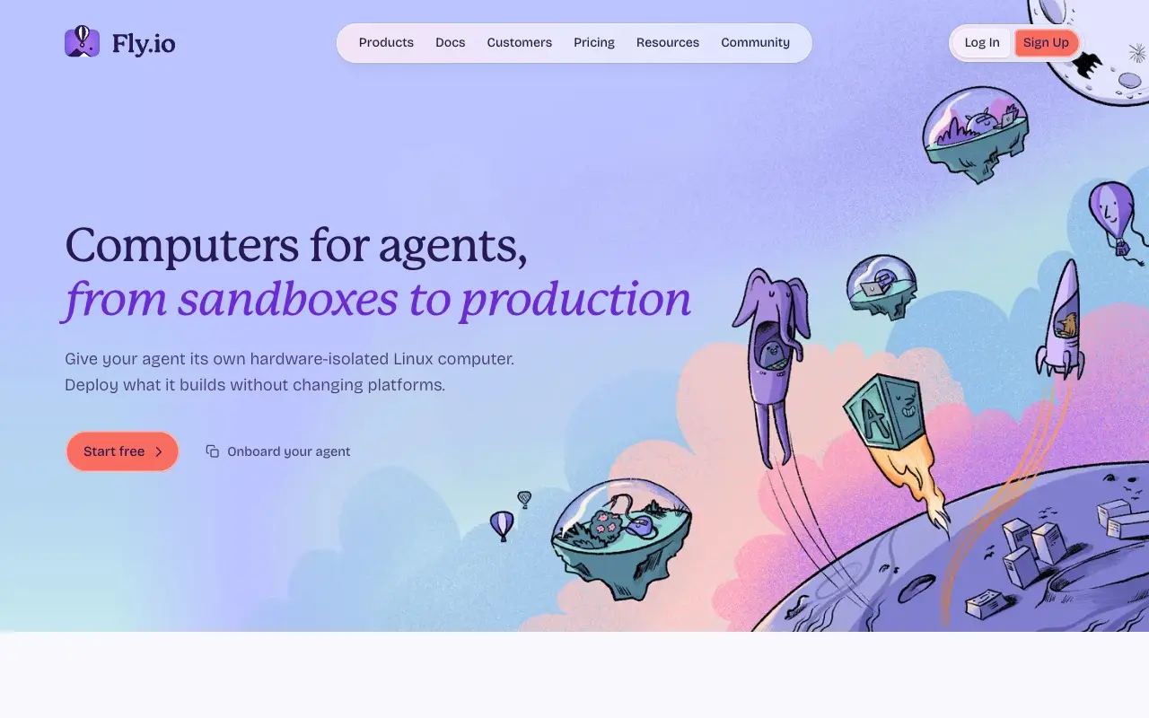
Fly.io runs on lilac and purple, the colors that would be the first red flag anywhere else. Not here, because what fills the screen is hand-drawn, funny illustration: floating islands under domes, balloons, a rocket, a cube with a face. Nobody mistakes them for another company's.
The headline is set in a serif with the second line in italics, followed by a single sentence on what you get. One more detail, in the HTML: a note asking AI agents to refetch the page as Markdown and pointing them to its llms.txt.
The takeaway: color isn't what makes a site generic; having nothing of your own on top of it is. One illustration made for you changes everything around it.
Ghostty
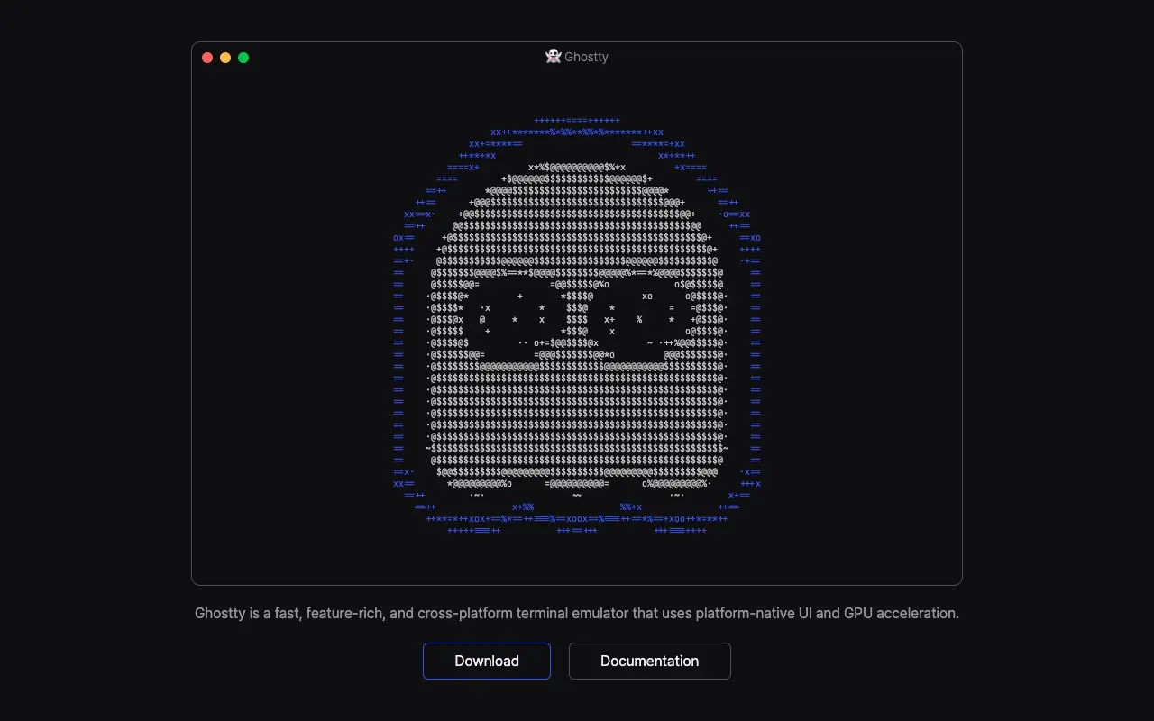
Ghostty is a terminal emulator, and its home page is a terminal: a window holding the logo's ghost drawn in characters, the way you'd draw it in a console. Below, one sentence on what it is (fast, cross-platform, native UI, GPU acceleration) and two buttons, download and docs.
The takeaway: make the home page a sample of the product. If your tool renders text, draw with text; if it makes charts, let the hero be a chart.
htmx
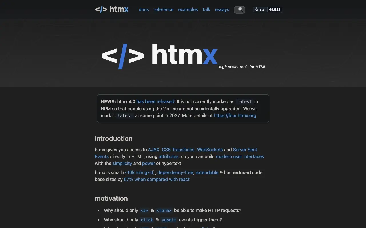
htmx is the plainest of the five: logo, a news box and text. But the box says something specific (htmx 4.0 is out, it isn't tagged latest on NPM so 2.x users don't upgrade by accident, and it will be at some point in 2027), and a short scroll down the page hands you the <script> tag to copy and an example button using hx-post.
The takeaway: for a technical crowd, working code is the best visual. A home page that lets people try the product in ten seconds doesn't need a hero.
What all five have in common
- The product comes first. A terminal, an editor, a rack, a code snippet: something that could only be theirs.
- Specific words.
sum_tree.rs, "Fig. 1", htmx 4.0 and 2027 instead of "the platform for modern teams". - A color with a job. Oxide's green, Zed's red and blue, htmx's blue: each one marks something rather than decorating.
- A type decision of their own: Oxide's monospace, Fly.io's serif and italics, Zed's monospaced italics.
If your site is also software and also dark, the Slop Score tells you whether it falls into "Dark mode with dim gray text" or "Colored glow around boxes", the two shortcuts of this category. And if you want to handle type the way Oxide or Fly.io do, start with a different font for your headings.
Frequently asked questions
What should a developer tool website include?
The product running on the first screen (the interface, a terminal or code to copy), one specific sentence on what it does and a direct way into the docs. The five sites in this post get there before any list of benefits.
How do I make my SaaS landing page not look AI-generated?
Swap the benefit cards for a real sample of the product, write with your own names and facts, and make one type or illustration decision that's yours, like Oxide, Zed or Fly.io.