Six architecture studios that put the work up front.
None of them opens with a slogan about "spaces that inspire" or three service cards. They open with a building, a city and a project name: the work, shown rather than described.
An architecture studio sells something you can photograph, yet plenty of AI-built service sites hide the work behind icons, gradients and paragraphs of values. These six do the opposite, each in its own way.
I picked studios with very different styles on purpose: black and white backgrounds, lots of text and almost none, an open menu and a hidden one. What they share isn't a look. It's a set of priorities.
Snøhetta
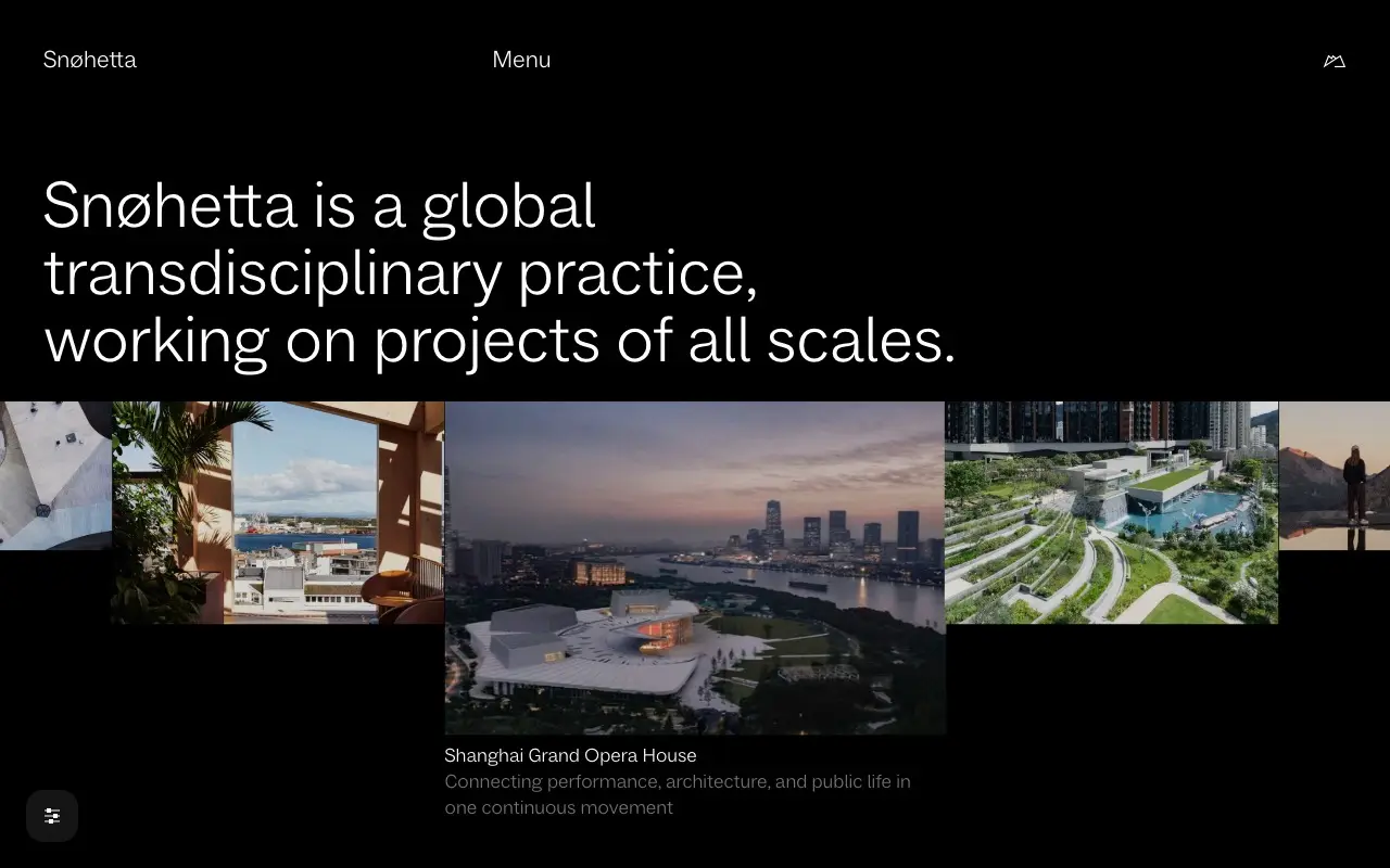
Snøhetta uses its headline to say what it is in one plain sentence, with no marketing adjectives: a transdisciplinary practice working on projects of all scales. Underneath runs a strip of photos that aren't the same size and don't sit on an even grid. The middle one carries the project name and a line explaining it.
The takeaway: if your photos come in different sizes, don't force them into identical cards. The size difference already tells people where to look first.
MVRDV
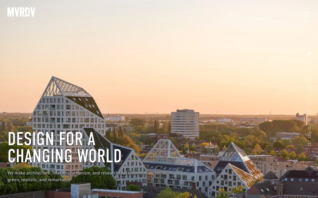
MVRDV puts one of its own projects full screen and little else: the logo, the menu and, at the bottom, a condensed headline with a single line on what they do (architecture, interiors, urbanism and research). The dots on the right signal more projects behind it.
The takeaway: one large, real photo of the work beats any background composition. If the photo is good, the copy can be short.
Olson Kundig
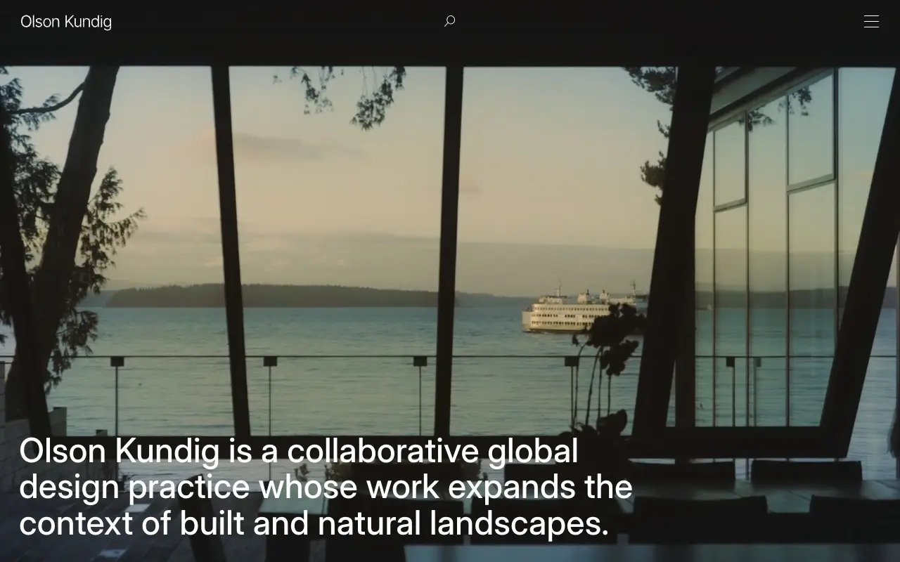
Olson Kundig doesn't show the building from outside. It shows the view from inside: water and a passing ferry, framed by the window mullions. That says how the space feels to live in without writing it. Projects follow as large slides with a name and a place, Beaverton, Oregon, for one.
A craft detail: if your system asks for reduced motion, the site notices, says so ("Reduced Motion Detected") and lets you turn motion back on if you want it.
The takeaway: honor prefers-reduced-motion and say you do. It's one line of CSS and one line of copy.
Herzog & de Meuron, Basel
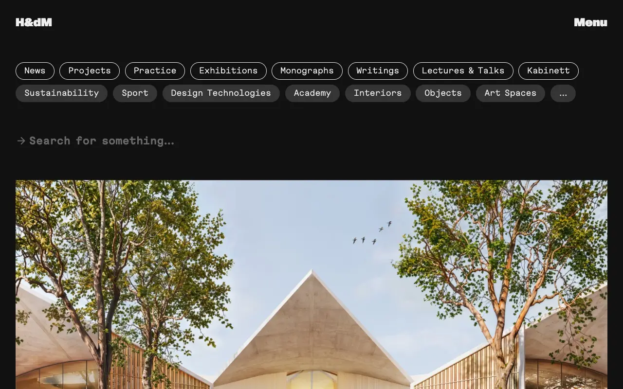
Herzog & de Meuron turns the menu into the homepage. Every section sits at the top (News, Projects, Practice, Exhibitions, Writings and more), with topics underneath (Sustainability, Sport, Interiors, Art Spaces), all visible instead of tucked into a hamburger. Then comes a search field and a long feed of projects and news, each with a number, name, place and date.
The takeaway: if you have a lot of work, let people filter it from the first second. A well-kept archive is design too.
Studio Gang, Chicago
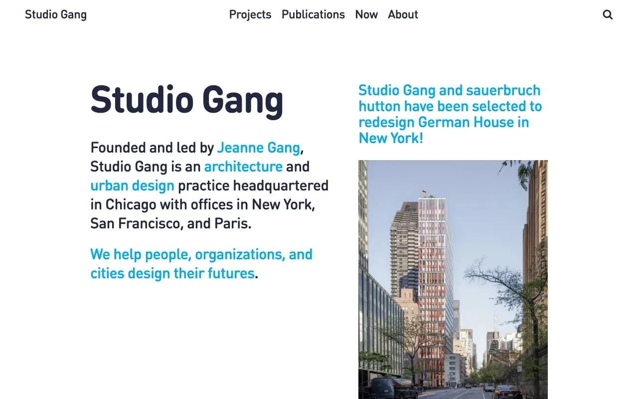
Studio Gang is the most text-heavy of the six, and it works because every sentence can be checked: who founded and leads it (Jeanne Gang), what it does (architecture and urban design) and where (headquartered in Chicago, with offices in New York, San Francisco and Paris). Links come in a single blue, inside the sentence. On the right sits the latest news item with its image.
The takeaway: the first sentence on your site should fail the name-swap test. If a competitor could use it unchanged, it says nothing.
BIG, Bjarke Ingels Group
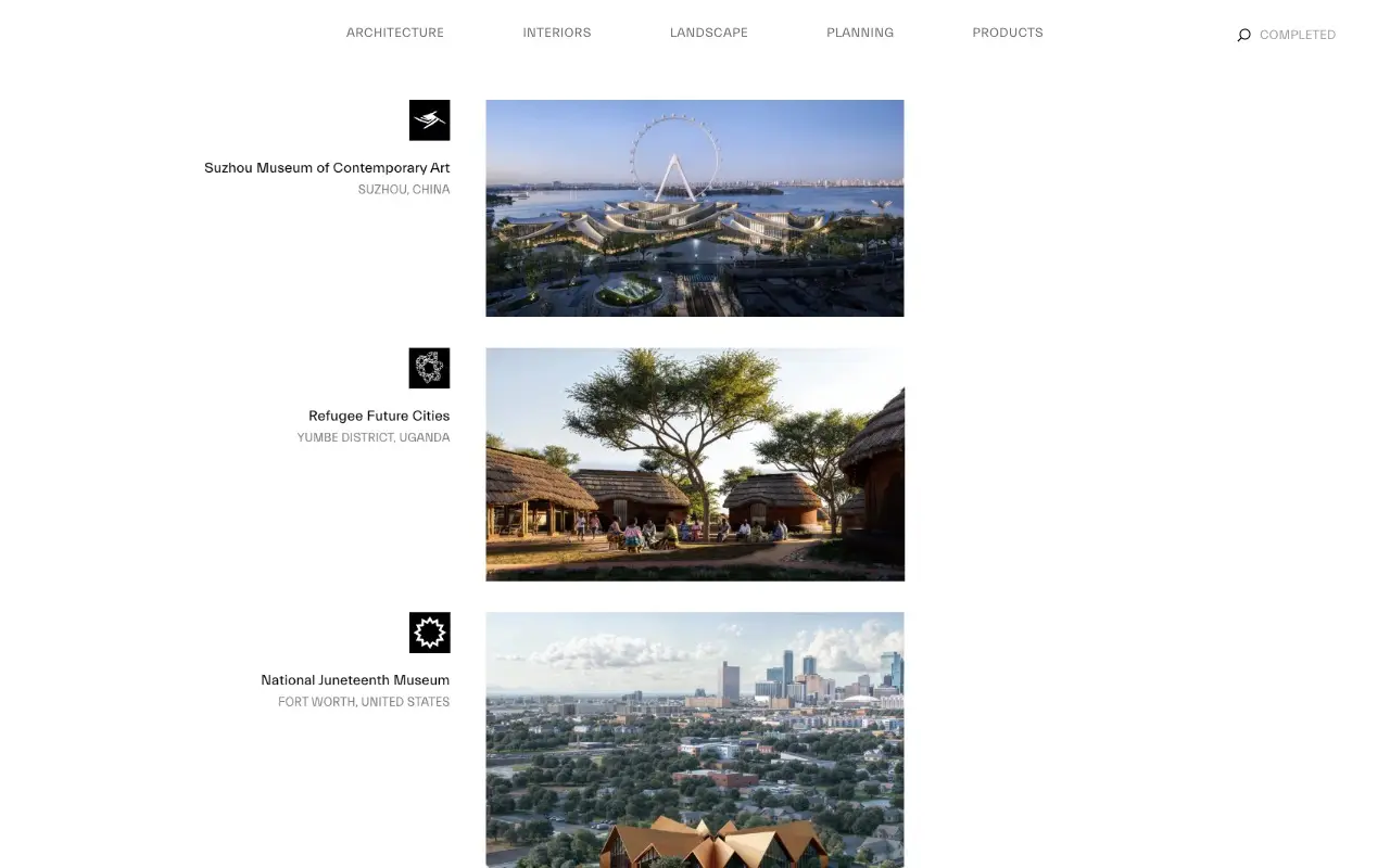
BIG lists its projects one under another, and each carries its own black pictogram next to the name and city: the Suzhou Museum of Contemporary Art, Refugee Future Cities in Uganda, the National Juneteenth Museum in Fort Worth. It's the opposite of a stock library icon: every symbol is different and belongs to a single project.
The takeaway: if you use icons, make them yours and make them mean something specific. One per real thing, not one per paragraph.
What all six do
- The work comes first. A photo or a project on the first screen, not a promise.
- Names and places instead of adjectives. Shanghai, Basel, Fort Worth, Jeanne Gang.
- No three-card grid with icons. Where there are lists, every item is a real project with its photo.
- Each one makes a call that sets it apart: MVRDV's condensed type, Herzog & de Meuron's monospace, BIG's pictograms.
If your site shows nothing of your own, Slop Score flags it as "No images of your own". Measure yours, and for examples from another field, the hotels solve the same problem with rooms instead of buildings.
Frequently asked questions
What should an architecture firm website include?
Real project photos on the first screen, the name and location of each project, who runs the studio and where it is. The six sites in this post cover that before any slogan.
How do I make my portfolio not look like a template?
Let the work take up the space, use photos of different sizes instead of identical cards, and make one typographic or navigation choice of your own, as MVRDV, Herzog & de Meuron and BIG do.