Five education sites that aren't templates.
Recurse Center, MIT OpenCourseWare, Hack Club, Exercism and The Odin Project show their method with real photos or their own drawings. Here is what each shows and what to copy.
An AI-built course site tends to repeat the same mold: "Master new skills", three cards with an icon and a sign-up button. A real school can show something better: how people learn there, who learns, and what happens on day one.
All five sites were opened on 21 November 2026 and their first screen was looked at. What follows is what each one shows, not what a design gallery says about it.
Recurse Center
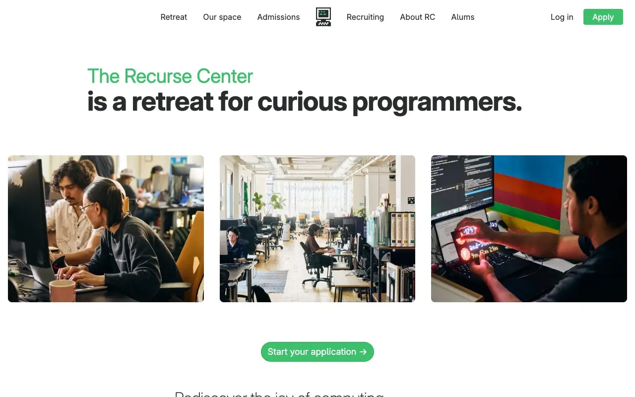
Recurse Center opens with a sentence that is already a definition: "The Recurse Center is a retreat for curious programmers." The first half is green and light, the second bold and black. Below, three large photos of people at work: two in front of a screen, a room of desks with natural light and someone holding a glowing device. There is one action, "Start your application →", and the same green on "Apply" at the top right.
To copy: photos of the place and of the people who attend, not models with a laptop, and one color reserved for the action.
MIT OpenCourseWare
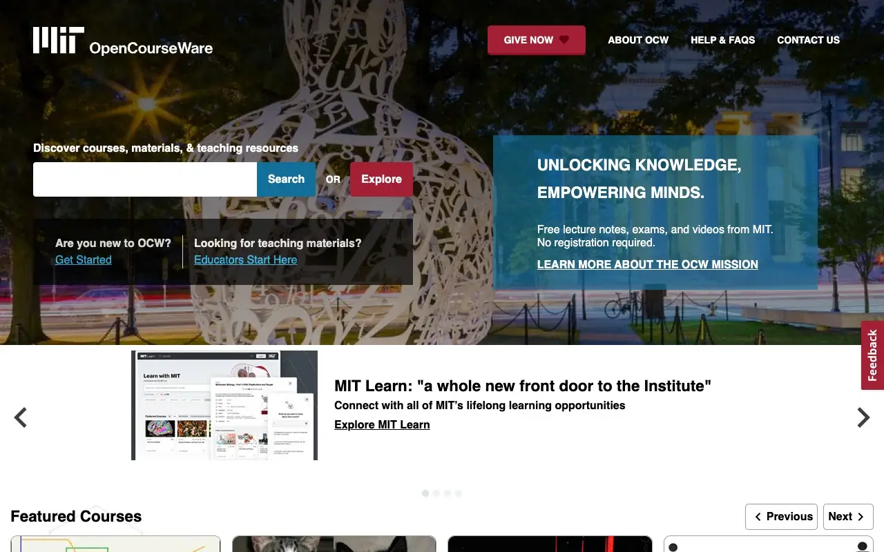
MIT OpenCourseWare puts the search box on the left of the first screen: a field, a "Search" button and, next to it, "Explore". On the right, a blue box with "Unlocking knowledge, Empowering Minds." and the line that matters: "Free lecture notes, exams, and videos from MIT. No registration required." Featured courses follow, each with its code and level (for example "15.988 | Graduate").
To copy: say in one sentence what you get for free and with no sign-up, and show real courses with their codes before any promise.
Hack Club
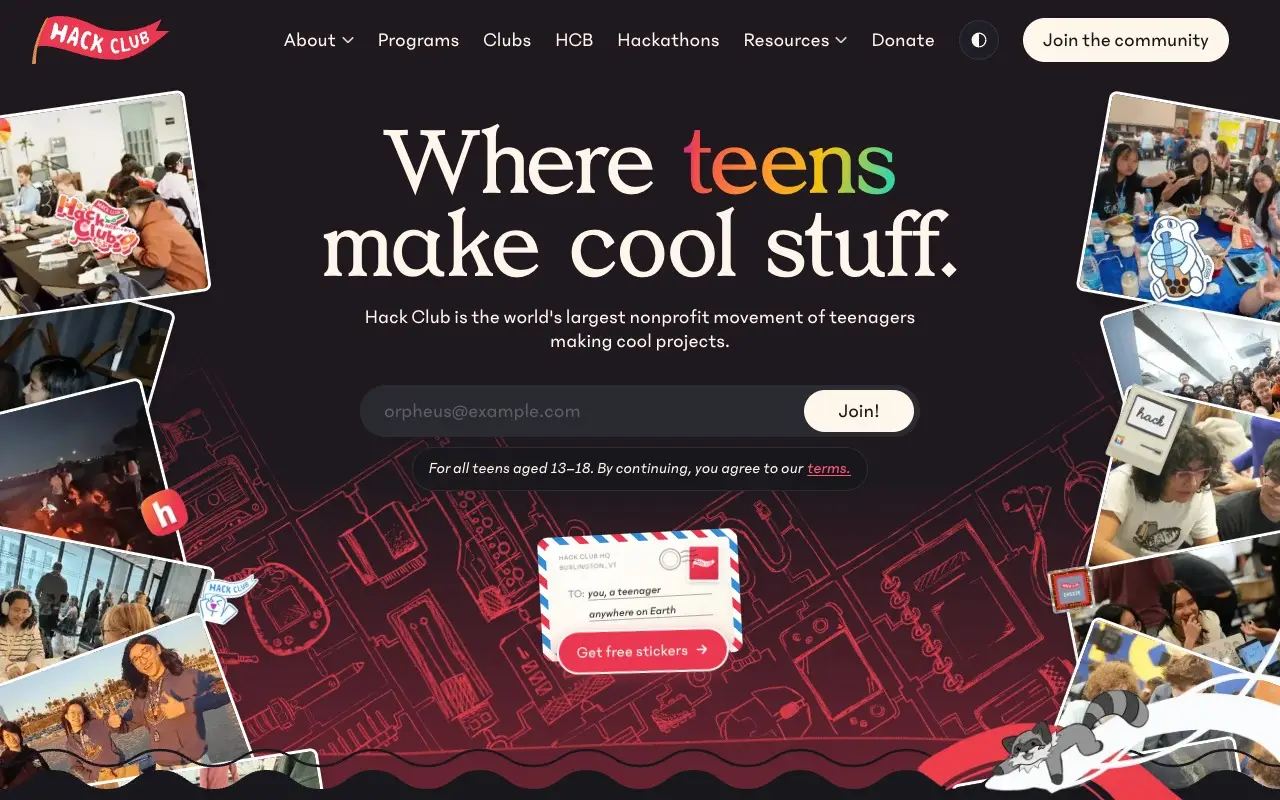
Hack Club writes "Where teens make cool stuff." in a large serif on a dark background, with "teens" in a color gradient. On both sides, tilted photos of teenagers at events and, behind, a line drawing of objects in red. The email field and the "Join!" button are in view, with "For all teens aged 13–18." Further down the page shows projects made by teenagers, with name, age and country.
To copy: sign-up inside the first screen and proof that people are making things, with their names, not a student counter.
Exercism
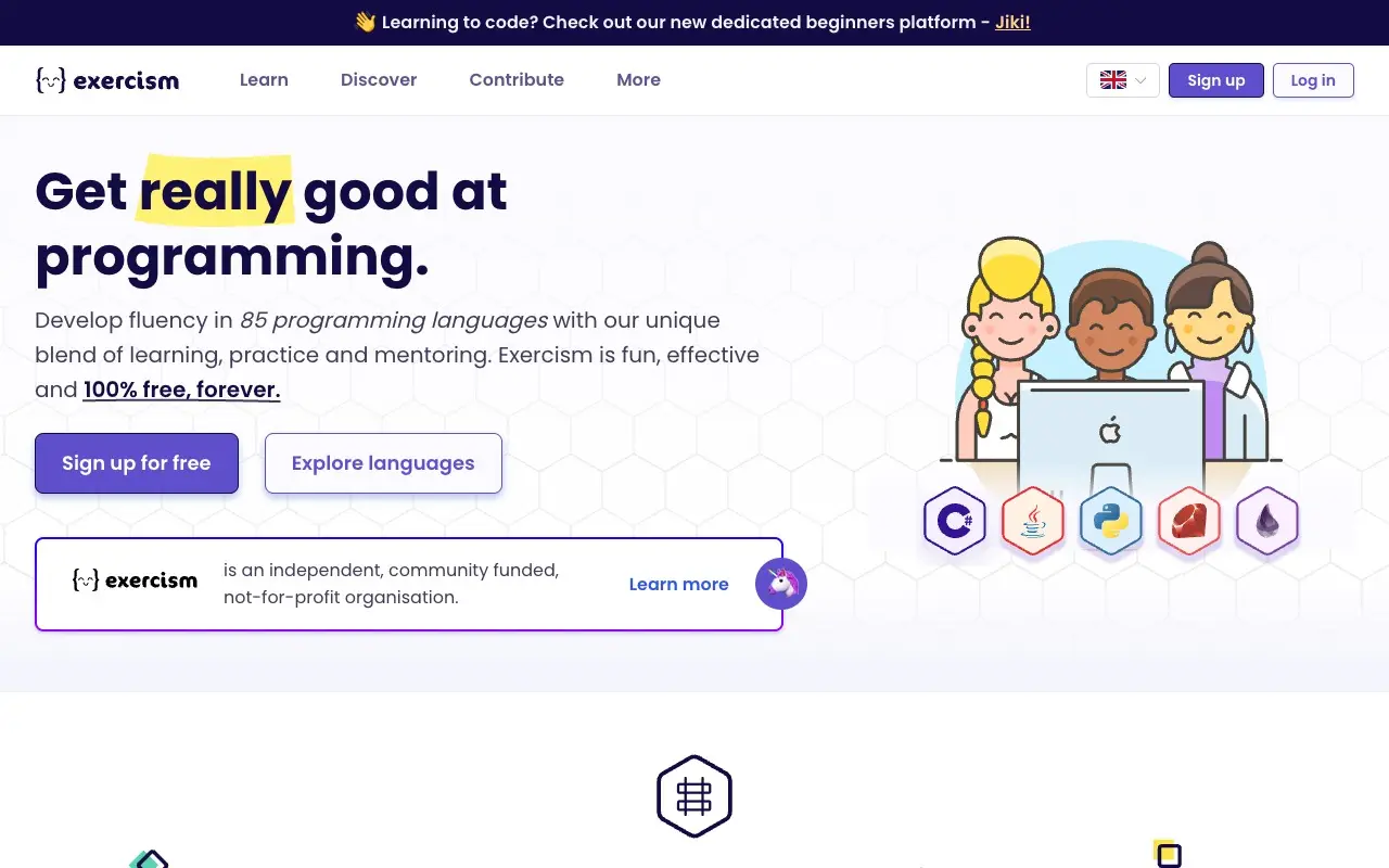
Exercism puts its promise in the headline: "Get really good at programming." with "really" marked in yellow, as with a highlighter. Below, the concrete figure (85 languages) and "100% free, forever". The two buttons are "Sign up for free" and "Explore languages". On the right, an original illustration of three people at a laptop with the language badges. A box says it is an independent, community-funded, not-for-profit organisation.
To copy: an illustration with its own style and a checkable figure instead of an adjective. The illustration is theirs, not from an image bank.
The Odin Project
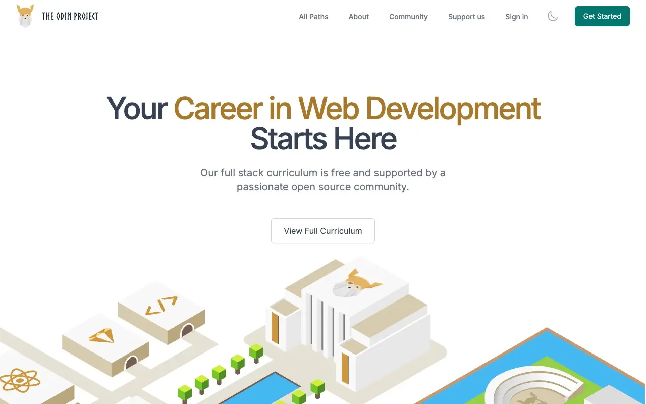
The Odin Project has a centered headline, "Your Career in Web Development Starts Here", partly in gold, a supporting line ("Our full stack curriculum is free and supported by a passionate open source community.") and one button, "View Full Curriculum". Below it peeks an isometric illustration of a campus with buildings, trees and a pool. The menu is short: All Paths, About, Community and Support us.
To copy: an illustration that tells the place (here, a campus) instead of a stock photo, and a four-item menu. Careful: a centered headline with a colored phrase is the most common mold on AI-built sites. The drawing is what saves it here.
What the five have in common
None promises to "transform your future". Each says what is studied and how, and the image is its own.
- Its own image. Photos of their space and people, or illustration made for them.
- A fact instead of an adjective. Free with no registration, 85 languages, ages 13 to 18.
- One color for the action. Green at Recurse, red at MIT, the light button at Hack Club.
- Getting in without searching. A button or a field on the first screen.
Compare it with your course's website: if the first screen can be written without knowing the school, it is a template. Run it through the Slop Score and check which slop patterns show up. If you run a nonprofit rather than a course, see the five nonprofits.
Sources
- Recurse Center, recurse.com, November 21, 2026
- MIT OpenCourseWare, ocw.mit.edu, November 21, 2026
- Hack Club, hackclub.com, November 21, 2026
- Exercism, exercism.org, November 21, 2026
- The Odin Project, theodinproject.com, November 21, 2026
Frequently asked questions
Which education websites are well designed?
Among those opened today, Recurse Center, MIT OpenCourseWare, Hack Club, Exercism and The Odin Project: each home page says in one sentence what you learn, uses its own imagery and lets you in without searching.