Five nonprofits that aren't templates.
Wikimedia, MSF, EFF, Greenpeace and HRW say who they are with an image of their own and keep donating in view. Here is what each shows and what you can borrow.
An AI-built nonprofit site tends to repeat the same mold: a headline about changing the world together, three cards with an icon and a donate button. A real organization has something better to show: its work, its people, its cause.
All five sites were opened on 19 November 2026. What follows is what each first screen shows, not what a design gallery says about it.
Wikimedia Foundation
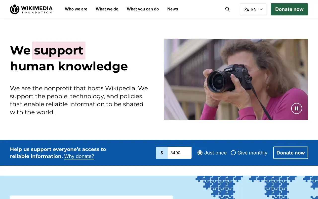
Wikimedia Foundation opens with a sentence that says what it does: "We open human knowledge", with the word "open" on a light blue highlight. Below it, a short paragraph ("We are the nonprofit that hosts Wikipedia") and, on the right, a photo of someone using a phone, with a visible pause button. The menu has four entries and a single green button, "Donate now". Further down, a blue strip with an amount field, "Just once" and "Give monthly" lets you donate without leaving the home page.
To borrow: a headline with a verb that describes the organization's work, and the donation form in view instead of a button that sends you to another page.
Médecins Sans Frontières
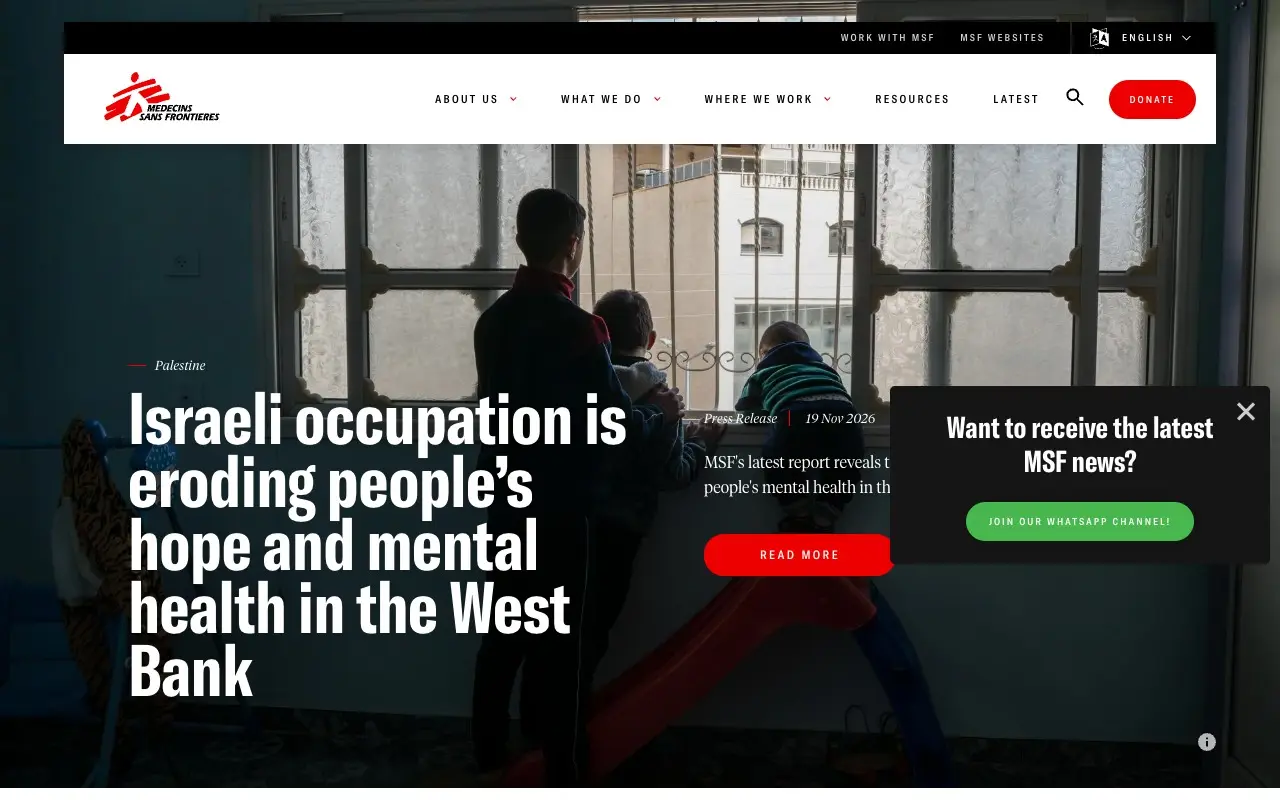
MSF puts a documentary photo at full width with a four-line headline over it, in a white condensed typeface. Above it sits a country label with a short red rule, and beside it a brief text with the date and the type of item ("Press Release"). There are only two actions, "Read more" and, at top right, "Donate", both in the same red as the logo. The menu is five words and a search.
To borrow: a single accent color, the brand's own, kept for what you can do, and a real photo telling the day's story instead of an illustration.
Electronic Frontier Foundation
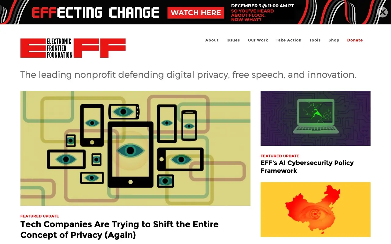
EFF has one of the most distinctive home pages of the group: a huge red logo, and under it a single gray sentence, "The leading nonprofit defending digital privacy, free speech, and innovation." Then comes a grid of featured stories whose illustrations are its own, with eyes inside screens and a map with an eye, all in a limited palette. Red "Featured update" labels and black titles on white set the reading order. At the top there is a black announcement strip with an X to close it.
To borrow: original illustration in a few colors instead of stock photos, and a sentence that says who you defend rather than a generic promise.
Greenpeace International
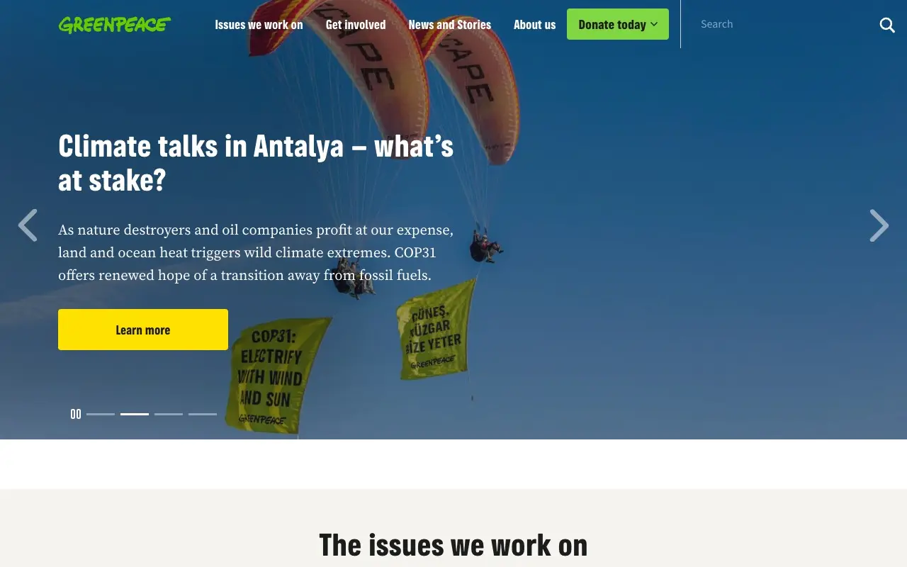
Greenpeace opens with a four-image carousel that has a pause button. In the slide on view, an action photo (two paragliders with banners) carries a white condensed headline, a paragraph in a reading serif and a yellow "Learn more" button. The logo is the familiar one, in a recognizable green. The buttons use two colors, green to donate and yellow to keep reading, and below it "The issues we work on" begins, centered, on a cream background.
To borrow: pairing a condensed headline with a reading serif so long text feels like a newspaper, and a carousel with a pause button.
Human Rights Watch
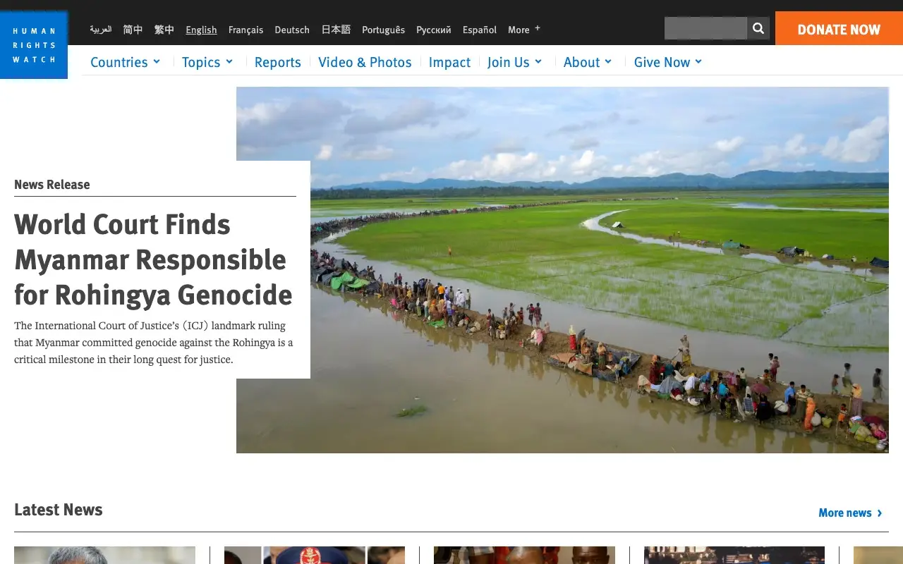
Human Rights Watch puts a large aerial photo on the right and, over it, a white box that extends to the left with the "News Release" label, a headline in a dark gray condensed grotesque and two lines of serif standfirst. The logo is a blue square with vertical lettering, the menu is blue on white and the only warm color on the screen is the orange of "Donate now". A bar with ten languages sits at the top.
To borrow: the white box that overlaps the photo, which gives the headline legibility without a dark overlay, and a single warm color for the action that matters.
What the five have in common
None opens with an abstract promise. Each home page says who it is and what it defends with its own image, and donating is always in view, but in a single color.
- An image that isn't stock. Documentary photos or original illustration.
- One color for the action. Red at MSF, orange at HRW, green at Wikimedia.
- Typography with character. Condensed for headlines and serif for reading.
- Donating without searching. The button or form is on the first screen.
Compare it with your organization's website: if the first screen can be written without knowing the organization, it is a template. Run it through the Slop Score and check which slop patterns show up.
Sources
- Wikimedia Foundation, wikimediafoundation.org, November 19, 2026
- Médecins Sans Frontières, msf.org, November 19, 2026
- Electronic Frontier Foundation, eff.org, November 19, 2026
- Greenpeace International, greenpeace.org, November 19, 2026
- Human Rights Watch, hrw.org, November 19, 2026
Frequently asked questions
Which nonprofit websites are well designed?
Among those opened today, Wikimedia Foundation, MSF, EFF, Greenpeace and Human Rights Watch: each home page uses its own imagery, typography with character and a single color for donating.