Five culture websites that aren't templates.
NTS, Serpentine, Walker, Barbican and Boiler Room open with real content, not a generic promise. Here is what each one shows and what you can borrow.
A culture website has an advantage over almost every other kind: it has things to show. Exhibitions, sessions, dates, tickets. When AI builds the home page of a theater or a radio station, it still fills it with a generic headline, three cards and a button. These five do the opposite.
I opened all five today, 12 November 2026. What follows is what each first screen shows, not what a design gallery says about it.
NTS
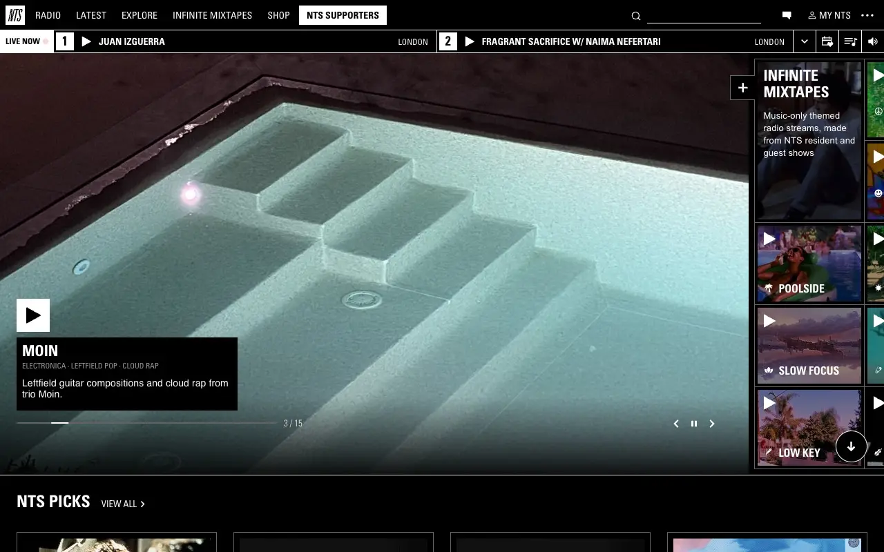
The first screen of NTS is black and always carries a bar on top with the two live channels and their play buttons. Below it, a full-screen image of a show with its title, genres and a line of text, in a carousel of 15, and on the right the "Infinite Mixtapes" panel. No text explains what NTS is: you listen. The slogan, "Free. No Ads. 24/7", sits in the footer.
To borrow: if what you offer can be listened to, make it playable on the first screen, and put genres inside the card, where they get read.
Serpentine Galleries
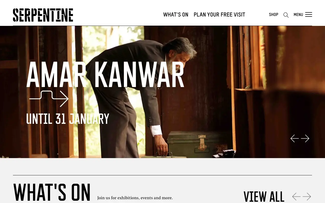
At Serpentine the hero is the exhibition: the title in huge condensed capitals with "Until 31 January" beneath it, over a full-width photo, with arrows to move to the next one. "What's On" repeats that large type. Each card in the list carries the venue, the dates and the word "Free", and the footer credits who made the visual identity, who designed the site and who built it.
To borrow: one condensed typeface with character for the titles, and the price, or the fact that it's free, on every card.
Walker Art Center
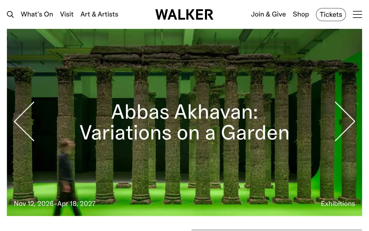
The Walker centers its name over a menu of few words, with "Tickets" as the only outlined button. The hero rotates between exhibitions: when I opened it, it showed "Abbas Akhavan: Variations on a Garden" with its dates, 12 November 2026 to 18 April 2027, over a large photo. Further down there is a sentence about when admission is free and a weekly list with a date and a category.
Some details almost never appear on a generated site: a skip-to-content link, alt text that describes each image and a guided tour with sign language interpretation in the listing.
To borrow: the name of the work and its dates as the headline, and the weekly list.
Barbican
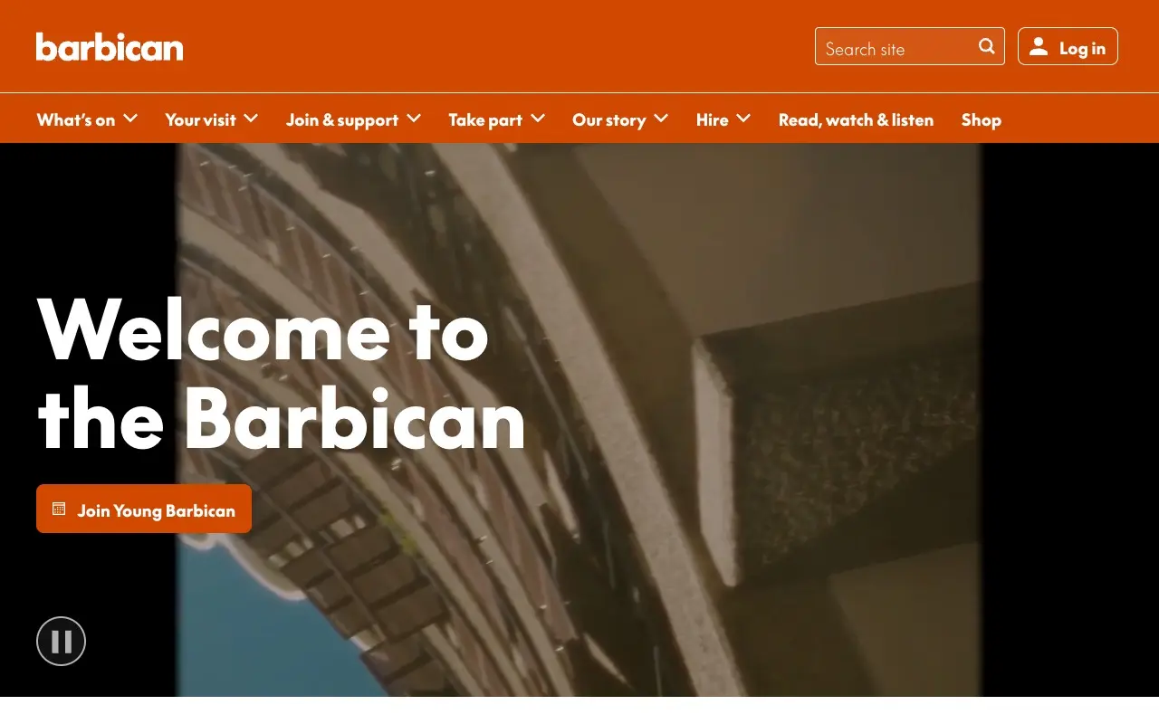
The Barbican has an identity you can't mistake: an orange bar with the full menu in view, a video of its own concrete building and "Welcome to the Barbican" in very large white type, with a pause button for the video. Further down it organizes by what the visitor wants to do: a "This week" section with three tabs (what's on, what's free and how to plan a visit) and prices up high, like "Young Barbican tickets from £6".
To borrow: a strong brand color of your own, and "Free" and "Plan your visit" tabs instead of a menu of internal names.
Boiler Room
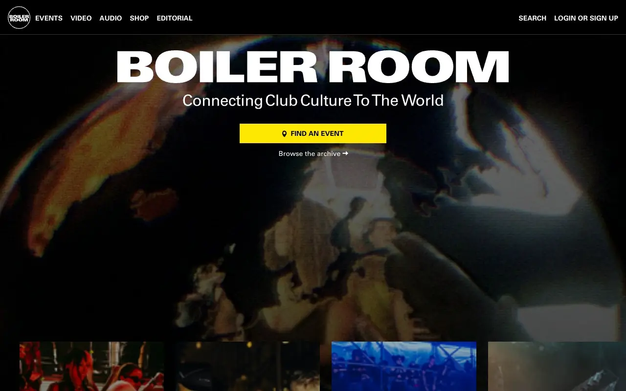
Boiler Room opens with its name enormous, one line ("Connecting Club Culture To The World"), a yellow button, "Find an Event", and a quiet link, "Browse the archive", over a grainy image of a globe. Then come horizontal rows: upcoming events with city and date, the shop with prices, the cities and recorded sessions.
To borrow: one main action and one secondary action with different weight, and the only vivid color on the screen on the button.
What the five share
None of them explains itself in three lines of promise. The hero is the content (a show, an exhibition, the building, the name itself) and the practical facts sit right beside it: the hour, the price, the date, the city.
- Content before brand line. A hero saying "Experience culture differently" says nothing; the name of the exhibition does.
- Practical facts on the card. Date, venue and whether it's free, where people look.
- Organized by intent. What's on today, what's free, how to get there.
- Care you don't see at first glance. Skip link, alt text, credits.
Compare it with your own site: if your first screen could be written without knowing the business, it's a template. Measure it in Slop Score and check which of the signals in the AI slop patterns guide show up.
Sources
- NTS, nts.live, November 12, 2026
- Serpentine Galleries, serpentinegalleries.org, November 12, 2026
- Walker Art Center, walkerart.org, November 12, 2026
- Barbican, barbican.org.uk, November 12, 2026
- Boiler Room, boilerroom.tv, November 12, 2026
Frequently asked questions
Which music and culture websites are well designed?
Among the ones I opened today, NTS, Serpentine Galleries, Walker Art Center, Barbican and Boiler Room: they open with real content, dates and prices, and each has a look of its own.