Five stores that aren't templates.
Frama, Oatly, Kinfolk, Mejuri and Pangaia open with the product or an idea of their own, not a generic promise. Here is what each shows and what you can borrow.
An AI-built store home page is usually the same one: a headline with a promise, three cards with an icon and a button. A real store has something better to show: the object, the collection, the season.
I opened all five today, 16 November 2026. What follows is what each first screen shows, not what a design gallery says about it.
Frama
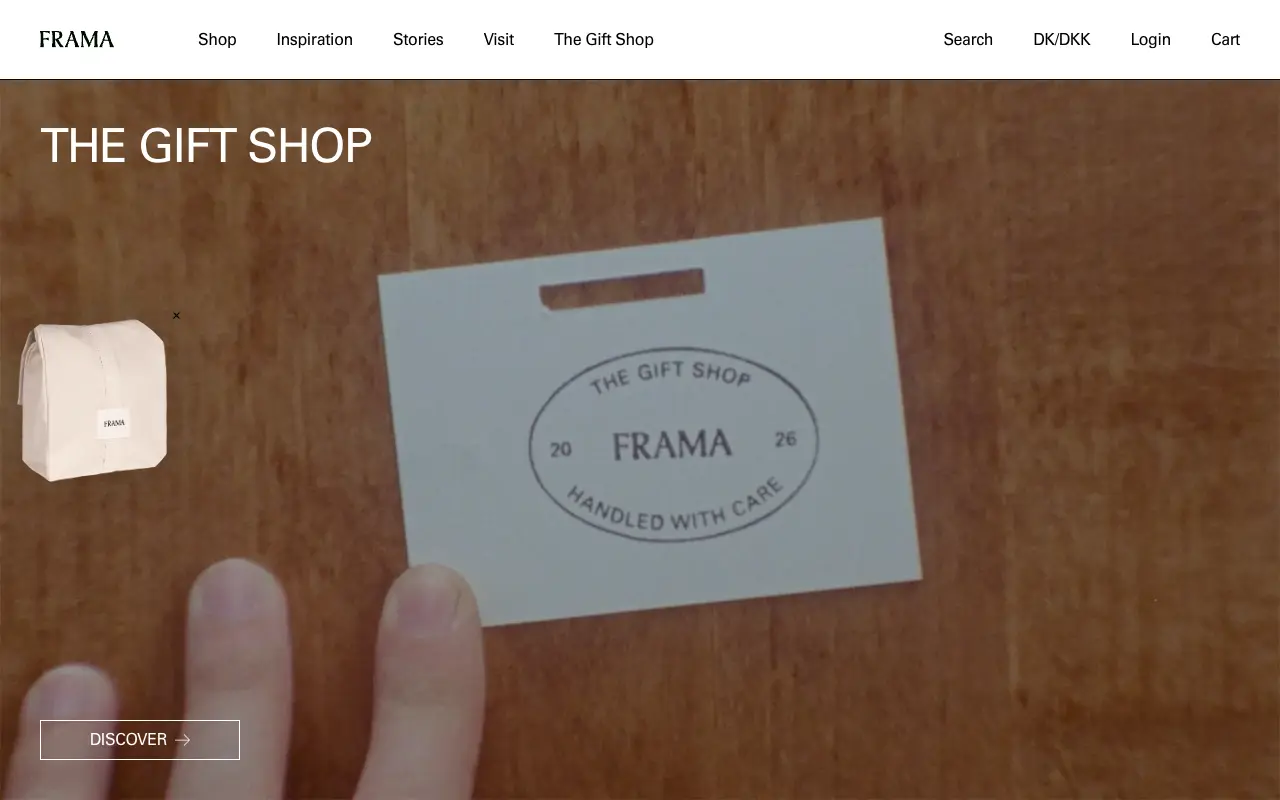
The first screen of Frama is a video: a hand on a wooden table holds a tag stamped "The Gift Shop, Frama, 2026, Handled with care". The title, white and in capitals, reads "The Gift Shop" and there is a single outlined button, "Discover". Above, a serif logo and a menu of five words: Shop, Inspiration, Stories, Visit, The Gift Shop. The free shipping notice and the cut-off date for delivery before Christmas are there, but in the top bar, where they don't compete with the image.
To borrow: the season or the collection as the protagonist, with an image that shows how the object feels, and one action.
Oatly
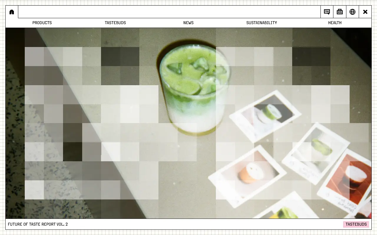
Oatly treats the screen like a program window on graph paper: a thin-line frame, FAQ, B2B and language icons, and a five-section menu (Products, Tastebuds, News, Sustainability, Health). The central photo, a matcha drink with instant photos, is partly pixelated, and the frame's footer says "Future of Taste Report Vol. 2" with a pink tag, "Tastebuds". Nobody would mistake that home page for another drinks brand.
To borrow: a visual language of your own that holds together (here, a window and a grid), and an editorial piece as the front page instead of a slogan.
Kinfolk
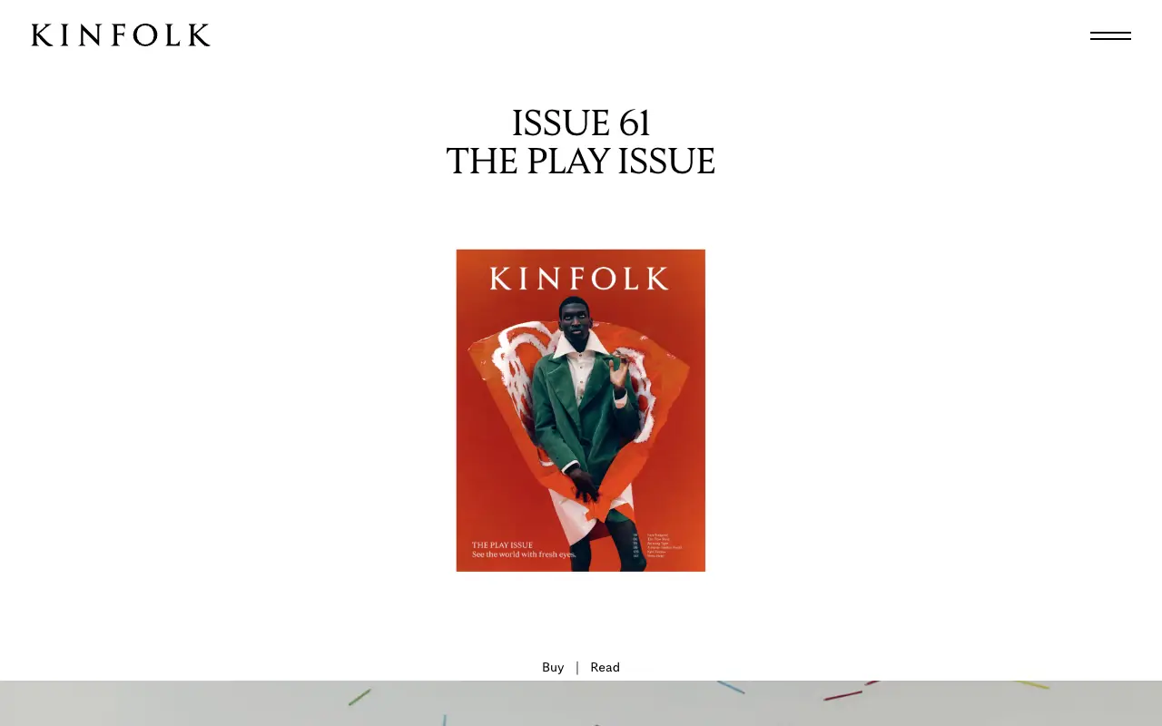
Kinfolk opens with the magazine issue: "Issue 61, The Play Issue", centered, with the cover in the middle and two links underneath, "Buy" and "Read". The logo is a serif in spaced capitals, the menu shrinks to a two-line icon and almost everything is white. Further down there is a list of stories with their category and a line saying what each is about.
To borrow: if you sell a product in editions or seasons, make the current one the front page, with buying and reading at the same height.
Mejuri
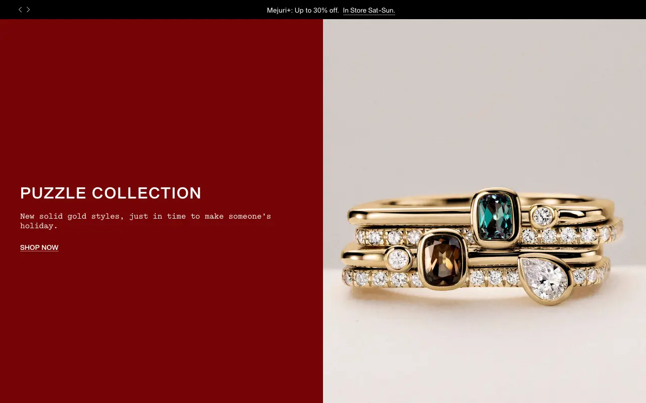
On Mejuri the screen splits in two. On the left, a dark red panel with "Puzzle Collection" in capitals, a line of text in a typewriter-like typeface ("New solid gold styles, just in time to make someone's holiday") and an underlined link, "Shop now". On the right, a close-up photo of stacked gold rings with colored stones. At the top, a black bar with an offer and a minimal two-arrow carousel.
To borrow: the product up close and at real scale, and a dark brand color behind it that makes what you sell look good, not a gradient.
Pangaia
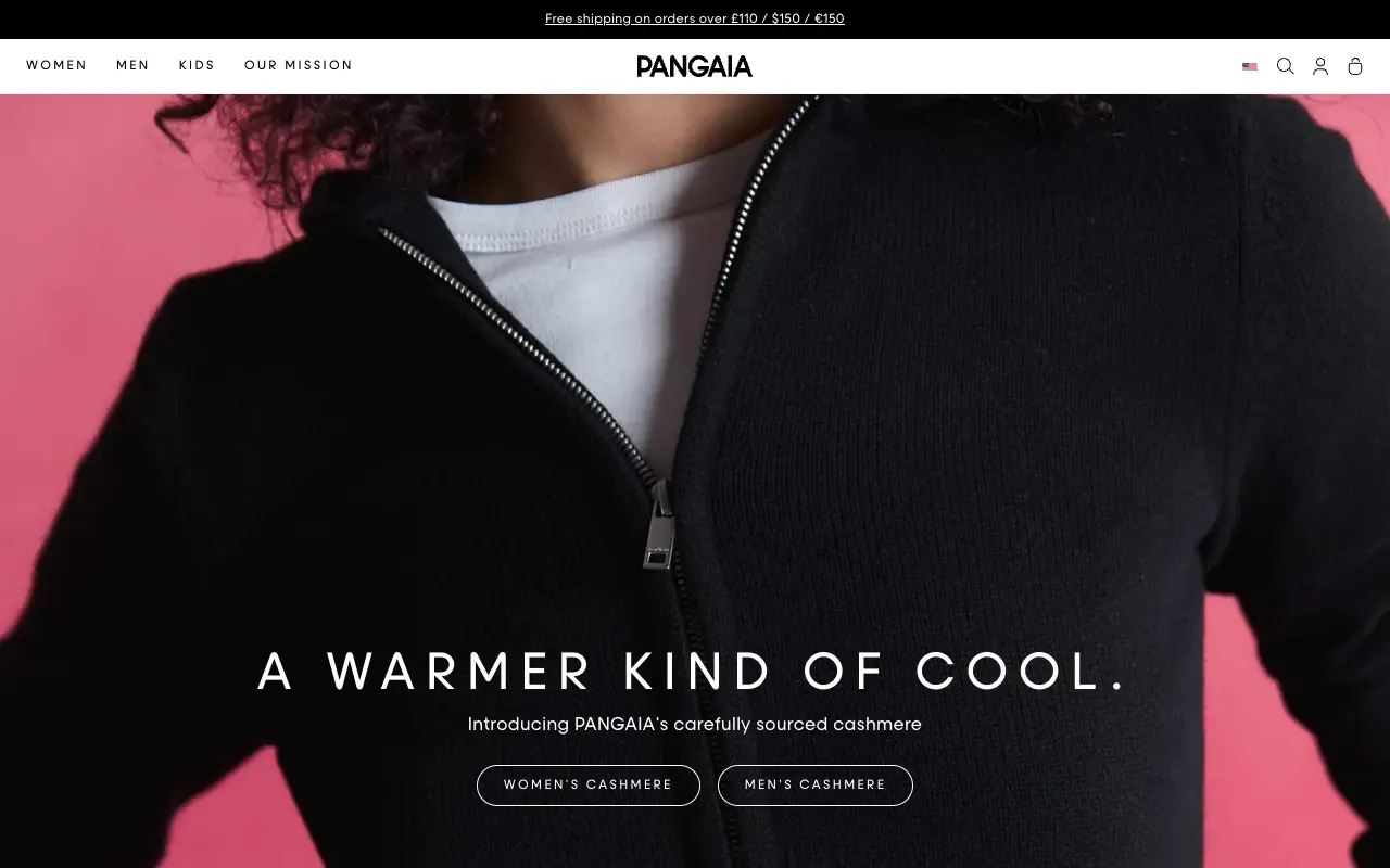
Pangaia puts a full-screen photo of the product, a black cashmere zip sweater on a pink background, with a headline in widely spaced capitals on top: "A warmer kind of cool." Below, one line ("Introducing PANGAIA's carefully sourced cashmere") and two outlined buttons, one for women and one for men. The menu is short (Women, Men, Kids, Our Mission) and the top bar spells out free shipping above a set amount.
To borrow: a headline that plays with the season and the brand (cool and warm), and the button split by customer instead of a generic "Shop now".
What the five share
None opens with "Discover products you'll love". The first screen is the piece that sells (an object, a magazine issue, a collection) and the practical stuff, shipping or an offer, sits in a separate bar.
- The product or the idea is the hero. A photo, a video or a cover, not an abstract headline.
- One clear action. One or two buttons, and the rest of the menu in a few words.
- A visual language of their own. A frame, a background color, a typeface that isn't confused with another store.
- The practical stuff, apart. Shipping, offers and cut-off dates in a bar that doesn't compete with the image.
Compare with your own store: if the first screen can be written without knowing the product, it's a template. Measure it with the Slop Score and check which signals from the list of slop patterns show up in it.
Sources
Frequently asked questions
Which online stores are well designed?
Among those I opened today, Frama, Oatly, Kinfolk, Mejuri and Pangaia: the first screen is the product or a piece of their own, with one clear action and a visual language that isn't confused with another store.