lumora.example

8 changes so it stops looking AI-made, from the one that matters most to the least.

Design auditOctober 29, 2026By @ignaprados

Lumora could be any product. The headline promises "the power of AI", the three emoji cards and faceless testimonials are straight out of the first prompt, and purple gradients cover every section. Nothing on the page shows what Lumora actually does or who it's for. The good news: most of this is fixed with copy, one real product screenshot and less decoration. No rebuild needed.

89%

Slop Score

Pure slop

0 is a hand-made site; 100 is what comes out of the first prompt. It measures template signals, not taste. Below 25 you earn the slop-free badge.

See the full Slop Score (opens in a new tab)

In your report, this is where the 10 to 15 minute video goes, with me walking through your site. Each change quotes what I said and jumps to the moment I explain it.

  1. 01The headline doesn't say what Lumora doesHigh priority
  2. 02Two hero buttons fighting each otherHigh priority
  3. 03Show the product instead of three emoji cardsHigh priority
  4. 04Numbers and testimonials nobody believesMedium priority
  5. 05AI purple, with gradients, in every sectionMedium priority
  6. 06The usual font, and everything centeredMedium priority
  7. 0726 of 29 links go nowhereLow priority
  8. 08No preview when sharedLow priority

Change 1High priorityHero

The headline doesn't say what Lumora does

Why it matters

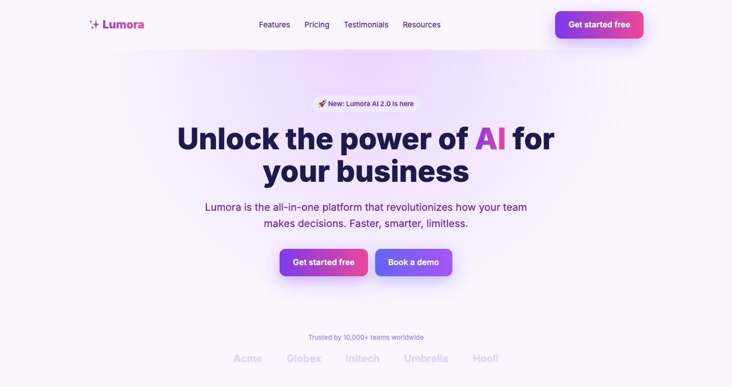
"Unlock the power of AI for your business" fits a thousand products. Visitors give you a few seconds to tell them whether this is for them; a generic promise makes them scroll to find out, and most won't.

What to do

Say what it does, who it's for and what they get. Something like: "Lumora reads your store's sales and tells you every Monday what to restock." One line underneath with the how. Drop the "New: Lumora AI 2.0" pill.
Screenshot of your site: Hero
Prompt for your agent
Where: the homepage hero, the h1 "Unlock the power of AI for your business" and the paragraph below it.

What to change: replace the h1 with a sentence under 12 words that says what the product does, who it's for and the result, without the words "unlock", "power", "AI", "revolutionize" or "next level". Cut the paragraph below to a single line explaining how. Remove the "🚀 New: Lumora AI 2.0 is here" pill. Remove the gradient from the h1 text: one solid color.

Don't touch: the nav, the buttons (there's a separate change for them) and the other sections.
Change 2High priorityHero

Two hero buttons fighting each other

Why it matters

"Get started free" and "Book a demo" have the same size, the same gradient and the same glow. When two actions weigh the same there is no main one, and people hesitate right when they should be deciding.

What to do

Pick one main action (if the product can be tried alone, "Get started free") and give it the only filled button. The demo becomes a text link next to it. Same in the nav: one button.

Screenshot of your site: Hero
Prompt for your agent
Where: the two hero buttons, "Get started free" and "Book a demo".

What to change: keep "Get started free" as the only filled button, in a solid color (no gradient, no colored shadow). Turn "Book a demo" into an underlined text link next to it, with no background or border.

Don't touch: the button labels, the headline or anything else on the page.

Change 3High priorityFeatures

Show the product instead of three emoji cards

Why it matters

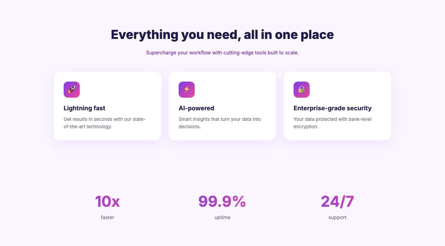
🚀 Lightning fast, ⚡ AI-powered, 🔒 Enterprise-grade security: the three cards any tool could have. Four screens of scrolling and not a single image of Lumora actually working, which is the one thing that convinces.

What to do

Put a real product screenshot under the hero, large, with no fake browser frame. Replace the three cards with three concrete things Lumora does, each with a crop of the screen where it happens. No emoji icons.

Screenshot of your site: Features
Prompt for your agent
Where: the "Everything you need, all in one place" section with the three cards (🚀, ⚡, 🔒), and the space under the hero.

What to change: add a large image under the hero with a real product screenshot (leave a placeholder at /public/product.png and I'll replace it). Replace the three cards with three alternating rows (text on one side, screen crop on the other), each describing one concrete feature with a heading that says what happens, not an adjective. Remove the emoji icons.

Don't touch: the hero and the sections below.

Change 4Medium priorityTestimonials

Numbers and testimonials nobody believes

Why it matters

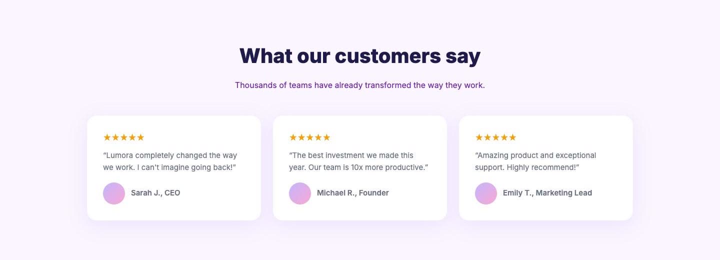
"10x faster", "99.9%" and "24/7" without saying compared to what; grey logos of companies that don't exist; three five-star testimonials with a colored circle for a face and "Sarah J., CEO" with no company. Template social proof takes trust away instead of adding it.

What to do

If there are no named customers yet, remove the stat strip, the logos and the testimonials: no social proof beats proof that looks made up. When you have it: full name, company, a real photo and one sentence about a concrete result.

Screenshot of your site: Testimonials
Prompt for your agent
Where: the "Trusted by 10,000+ teams worldwide" logo strip, the stat strip (10x, 99.9%, 24/7) and the "What our customers say" section.

What to change: remove all three. Leave a Testimonial component in the code that takes name, company, photo and quote, with no stars, for when there are real ones.

Don't touch: the rest of the page.

Change 5Medium priorityPricing

AI purple, with gradients, in every section

Why it matters

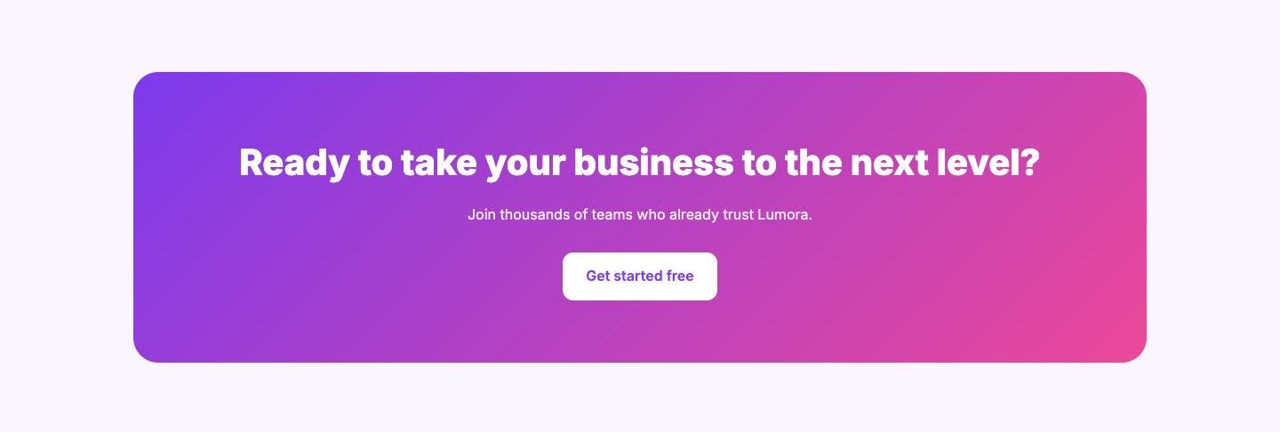
96% of the accent color is purple or indigo, and there are twelve purple-to-pink gradients: logo, headline, buttons, icons, numbers and the closing block. It's the palette that says "an AI made this" before anyone reads a word.

What to do

Pick a single accent color that isn't purple and use it only on the main action. White or near-white background, near-black text. No gradients on text or buttons; the closing block on a flat background.

Screenshot of your site: Pricing
Prompt for your agent
Where: the global styles and every gradient (logo, h1, buttons, icons, numbers, the "Ready to take your business to the next level?" block).

What to change: define two variables, --text (near-black) and --accent (a solid color that isn't purple, indigo or pink), and replace every linear-gradient and radial-gradient with flat colors. The accent goes only on the main button and links. Page background becomes white.

Don't touch: the copy and the structure.

Change 6Medium priorityWhy choose Lumora?

The usual font, and everything centered

Why it matters

Inter on 100% of the text and every heading centered, section after section, in the usual order (hero, features, why us, testimonials, final call). Nothing on the page says someone made a decision.

What to do

Pick a typeface with some character for headings (there are good free ones on Fontshare and Google Fonts) and left-align headings with the text column. The "Why choose Lumora?" ✅ list can go: it repeats the features.

Screenshot of your site: Why choose Lumora?
Prompt for your agent
Where: the global typography, every h1 and h2, and the "Why choose Lumora?" section.

What to change: load a heading typeface other than Inter (I suggest Satoshi or General Sans from Fontshare, self-hosted), weight 600, tight tracking. Left-align the h2s and their subheadings. Remove the "Why choose Lumora?" section with the ✅ list.

Don't touch: body text, which can stay in Inter.

Change 7Low priorityFooter

26 of 29 links go nowhere

Why it matters

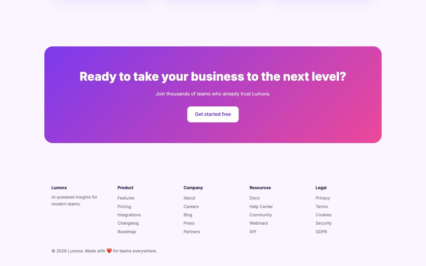
The footer has five columns and twenty-five links (Changelog, Roadmap, Careers, Press, Webinars…) and almost all of them point to "#". A dead link is worse than no link: it tells people the page is cardboard.

What to do

Keep only what exists in the footer: contact, legal and, if you have them, docs and pricing. Everything else goes until the page exists.

Screenshot of your site: Footer
Prompt for your agent
Where: the footer and the nav.

What to change: remove every link with href="#". Make the footer a single row with the name, the contact email, and links to Privacy and Terms. Replace "Made with ❤️ for teams everywhere" with just the ©.

Don't touch: the rest of the page.

Change 8Low priorityPage head

No preview when shared

Why it matters

The meta description and the social image (og:image) are missing. When someone shares the link on WhatsApp, Slack or X, it shows up empty.

What to do

Add a meta description that says what Lumora does and a 1200×630 image with the name and a product screenshot.

Prompt for your agent
Where: the homepage <head>.

What to change: add <meta name="description"> carrying the idea of the new hero headline (155 characters max), og:title, og:description, og:image (1200×630, leave /public/og.png as a placeholder) and twitter:card=summary_large_image.

Don't touch: anything visible on the page.

All of it, for your agent

Every change in a single prompt, in order. Paste it into Claude Code, Cursor, v0 or Lovable with your project open. The informe.md file has the same, plus each change with its section.

The changes, in orderDownload informe.md
You're going to fix the Lumora homepage in this order. Make one change at a time and show me the result before moving on.

1. Hero: replace the h1 "Unlock the power of AI for your business" with a sentence under 12 words saying what the product does, who it's for and the result. The paragraph below becomes one line about how. Remove the "New: Lumora AI 2.0" pill. Headline in one solid color, no gradient.
2. Hero buttons: "Get started free" as the only filled button, solid color, no colored shadow. "Book a demo" as a text link beside it. One button in the nav.
3. Product: a large real screenshot under the hero (/public/product.png placeholder). The three emoji cards become three alternating rows, each with one concrete feature and its screen crop. No emoji icons.
4. Social proof: remove the logo strip, the 10x / 99.9% / 24/7 strip and the testimonials. Leave a Testimonial component (name, company, photo, quote, no stars) for when there are real ones.
5. Color: variables --text (near-black) and --accent (solid; not purple, indigo or pink). Every gradient becomes a flat color; accent only on the main button and links. White background.
6. Type: a heading typeface with character (Satoshi or General Sans, self-hosted), weight 600, tight tracking; h2s left-aligned. Remove "Why choose Lumora?".
7. Links: remove every href="#". Footer in one row: name, email, Privacy, Terms and ©.
8. Head: meta description, og:title, og:description, 1200×630 og:image and twitter:card.

Don't change anything that isn't on this list.

Keep the slop from coming back

The prompt above fixes your site today. But next time you ask the AI for something new, it'll go back to its usual, because it knows nothing about this audit. These rules tell it: paste them once into your project settings and it'll follow them on every change.

In Lovable: open the project settings, go to Knowledge and paste the rules there.

design-rules.mdDownload
# Design rules for lumora.example

These come from the homepage audit. Read them before every change so Lumora doesn't drift back into looking like a template.

- Every headline says what Lumora does, who it's for and what they get, in under 12 words. Never "power", "AI", "revolutionize" or "next level".
- One filled button per screen, in a solid color with no colored shadow. The secondary action is an underlined text link.
- Show the product with real screenshots, large and without a fake browser frame. Never use emoji as icons.
- Don't add stats, customer logos or testimonials that aren't real. A testimonial needs a full name, company, real photo and one sentence about a concrete result. No stars.
- Colors come only from --text (near-black) and --accent (one solid color that isn't purple, indigo or pink), on a white background. The accent goes on the main button and links, nowhere else.
- No linear-gradient or radial-gradient anywhere: not on text, buttons or backgrounds.
- Headings use Satoshi or General Sans, self-hosted, weight 600 with tight tracking, left-aligned with the text column. Body copy stays in Inter.
- No filler sections like "Why choose Lumora?" with ✅ lists. If a section repeats what another already says, cut it.
- No href="#" links. If the page doesn't exist yet, neither does the link. The footer stays one row: name, email, Privacy, Terms and ©.
- Every new page ships with a meta description, og:title, og:description and a 1200×630 og:image.